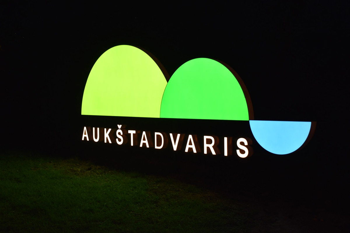
The logo of the city Aukštadvaris
The logo of Aukštadvaris is a symbolic, schematic image of nature with a restrained, laconic appearance, which reveals the main strength of Aukštadvaris - nature. The logo is unique in that when you look at it, you can see the symbols of hills and lakes, and when you turn it upside down, you can see fragments of the pit, burial mounds and the sky. The logo is used as a branding tool, goes along with published articles and reports in the public space, greets everyone entering Aukštadvaris and accompanies them when leaving.

Music album design
Gintarius' second studio album, Bet Kam Bet Kaip (2018), was covered by hand drawn illustrations. The concept of design is minimalist. All graphic elements generates a clean and simple graphic design. In the music album, the author focuses on the present day, singing about society, love, war and many more.
